 GRAPick.LK
Portfolio example
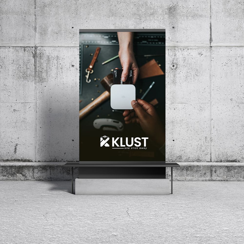
Brand identity direction
A visual identity exploration showing how colour, type, and composition can work together as a recognisable system.
Ask for something similar →These are selected examples from the existing GRAPick.LK portfolio. We describe them honestly without inventing client results or confidential project details.
A visual identity exploration showing how colour, type, and composition can work together as a recognisable system.
Ask for something similar →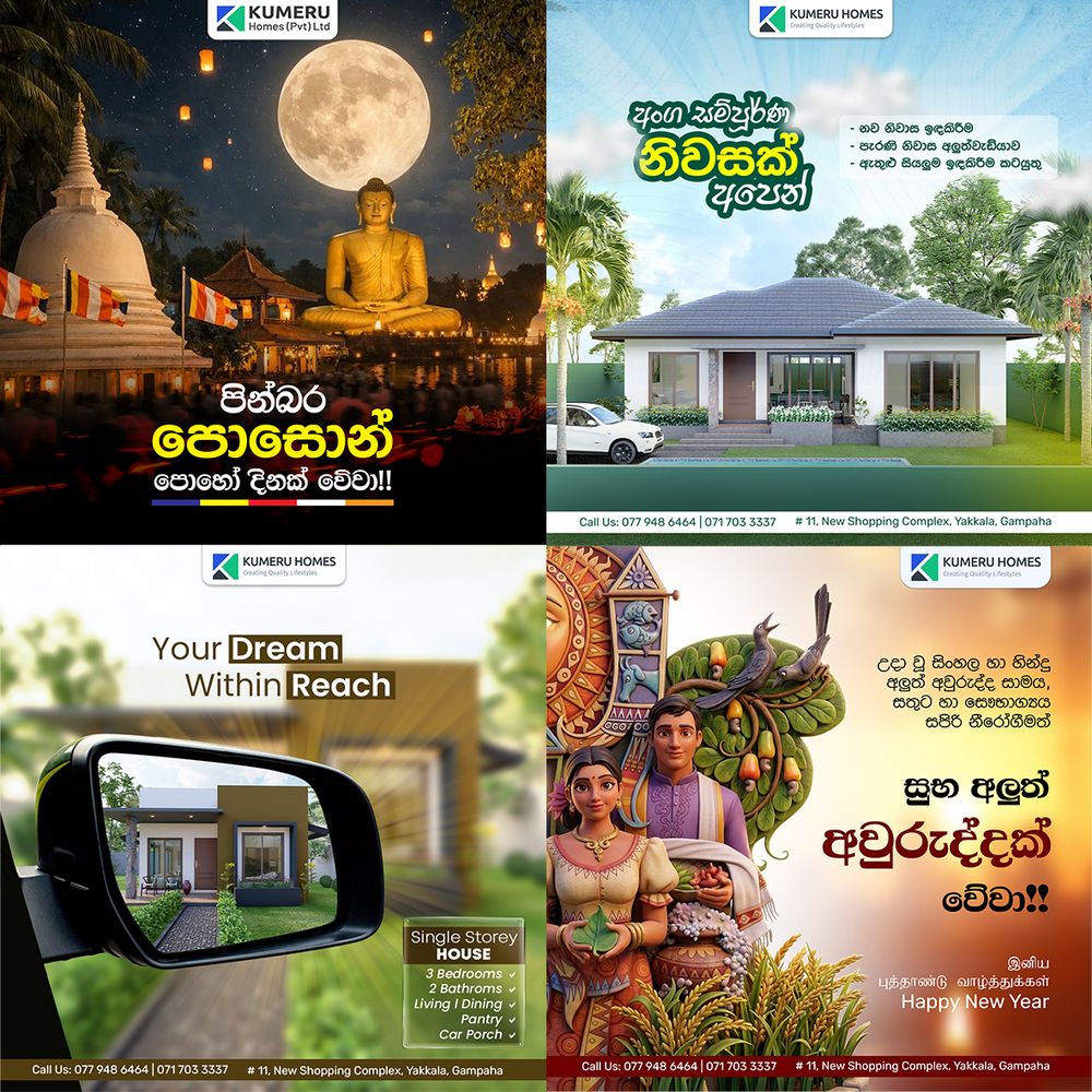
A digital-first composition that can guide web sections, social content, and launch materials.
Ask for something similar →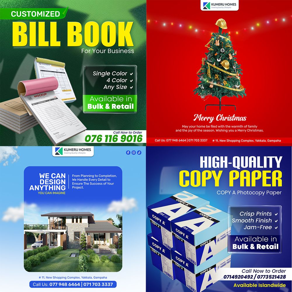
A print-oriented piece where hierarchy, spacing, and production awareness matter as much as the visual idea.
Ask for something similar →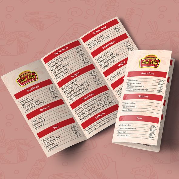
A bold graphic direction designed to hold attention while keeping the message easy to understand.
Ask for something similar →
A focused identity piece showing how a mark can become the starting point for a wider brand system.
Ask for something similar →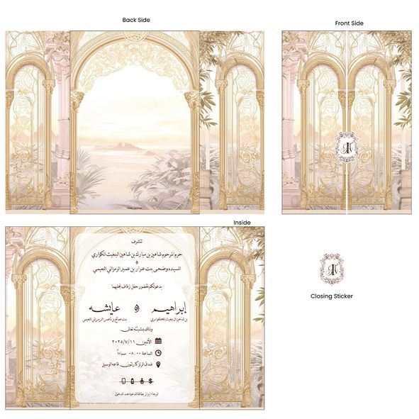
A structured layout direction for information that needs to feel clear, considered, and easy to scan.
Ask for something similar →We can point you to the most relevant examples and explain what a similar scope could include.